How We Rebuilt a National University Website and Helped It Achieve Record Admissions
Services
Client
Year
Website
When the President Is Coming, “Good Enough” Isn’t
In 2018, Romania’s oldest technical university faced a digital crisis: a decade-old website, fragmented and slow, just weeks before a presidential visit.With over 11 faculties, thousands of students, and a history spanning more than a century, it carries enormous cultural weight and visibility.
Then came the call:
“The President will attend the 150-year commemoration of Gheorghe Asachi’s death. We need a new website—fast.”
Four weeks.
National press coverage.
Tens of thousands of visitors expected.
Failure wasn’t an option.
What began as an emergency turned into one of the most successful higher-education redesigns in the country.
Context: A Legacy Out of Sync With Its Digital Presence
For more than a century, TUIASI has stood for excellence in engineering and innovation.
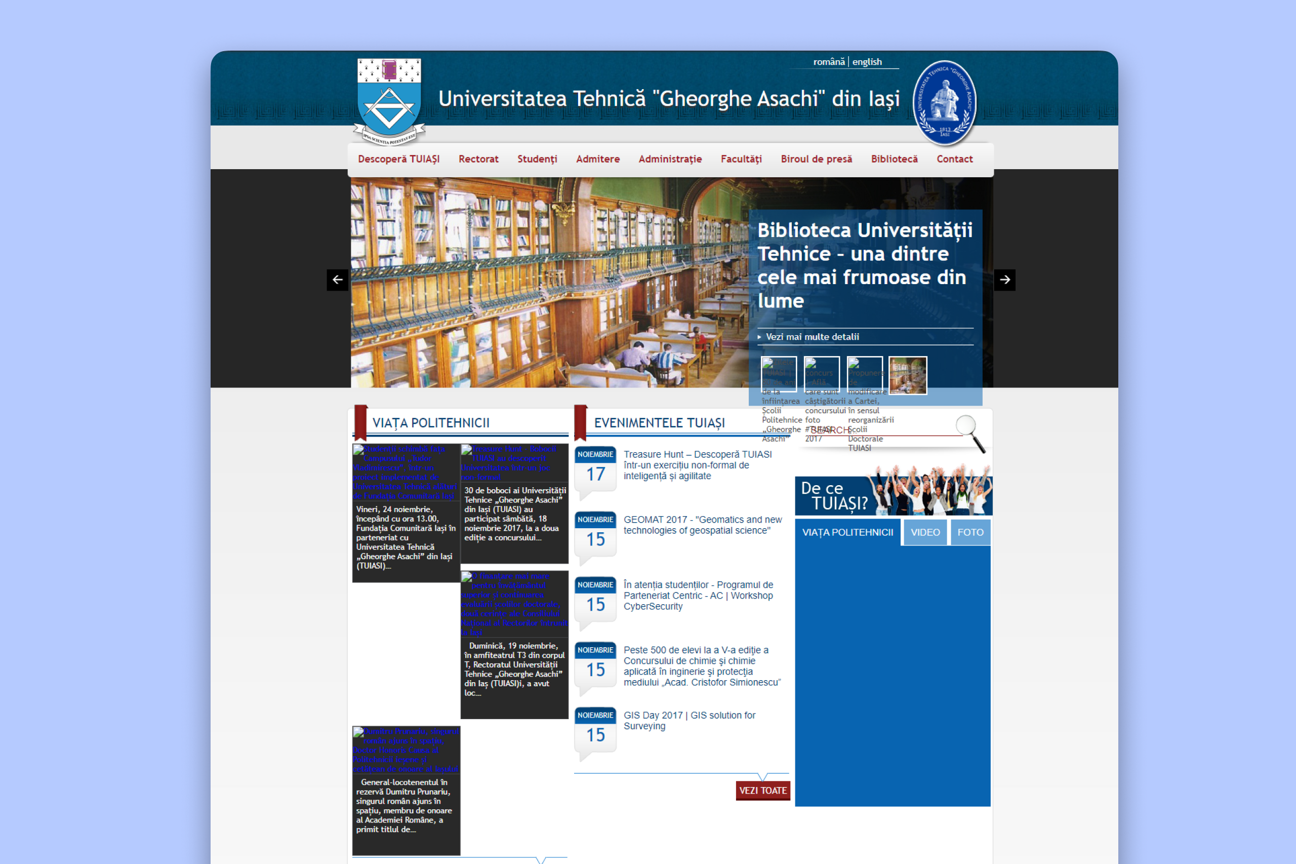
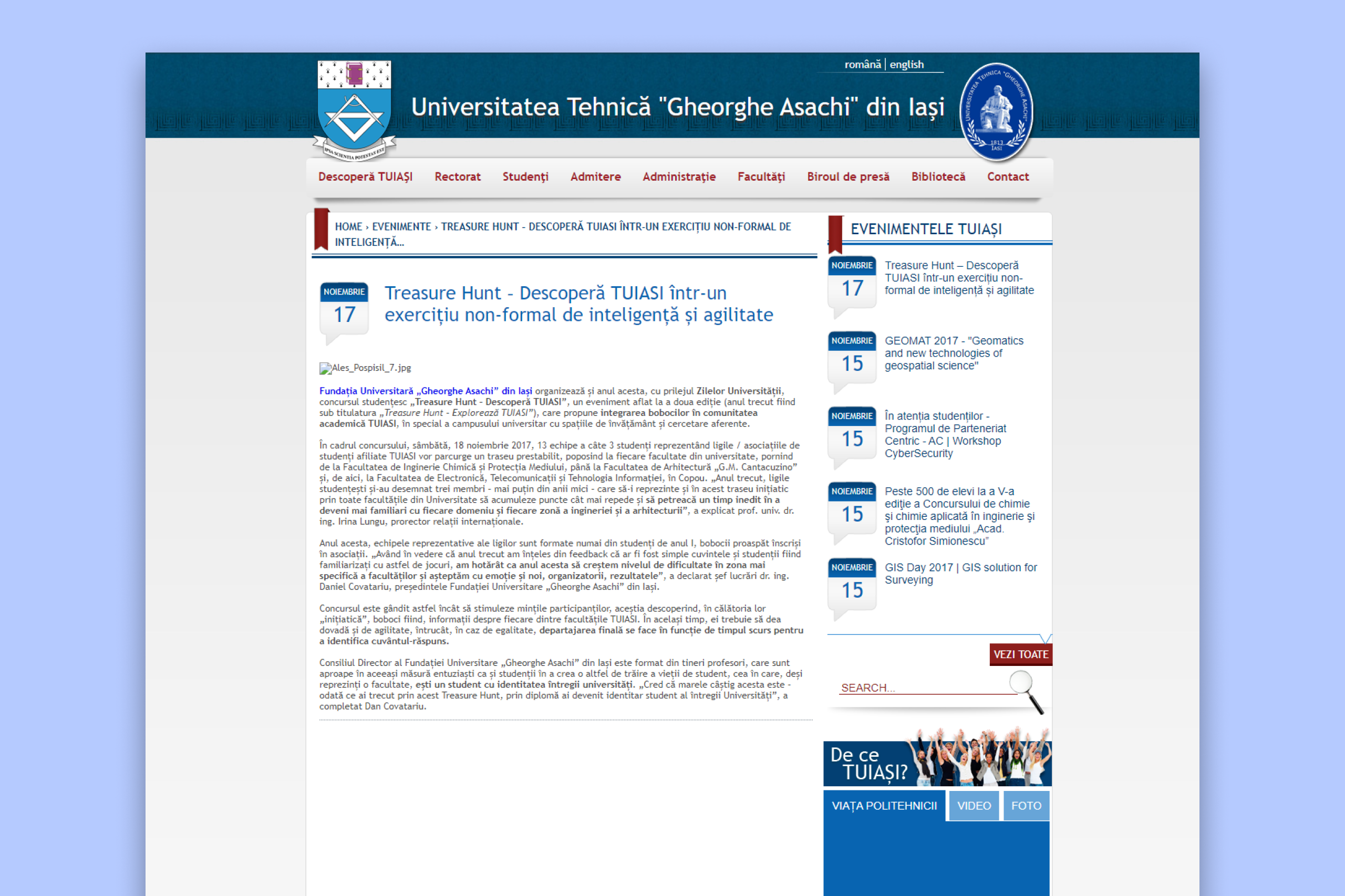
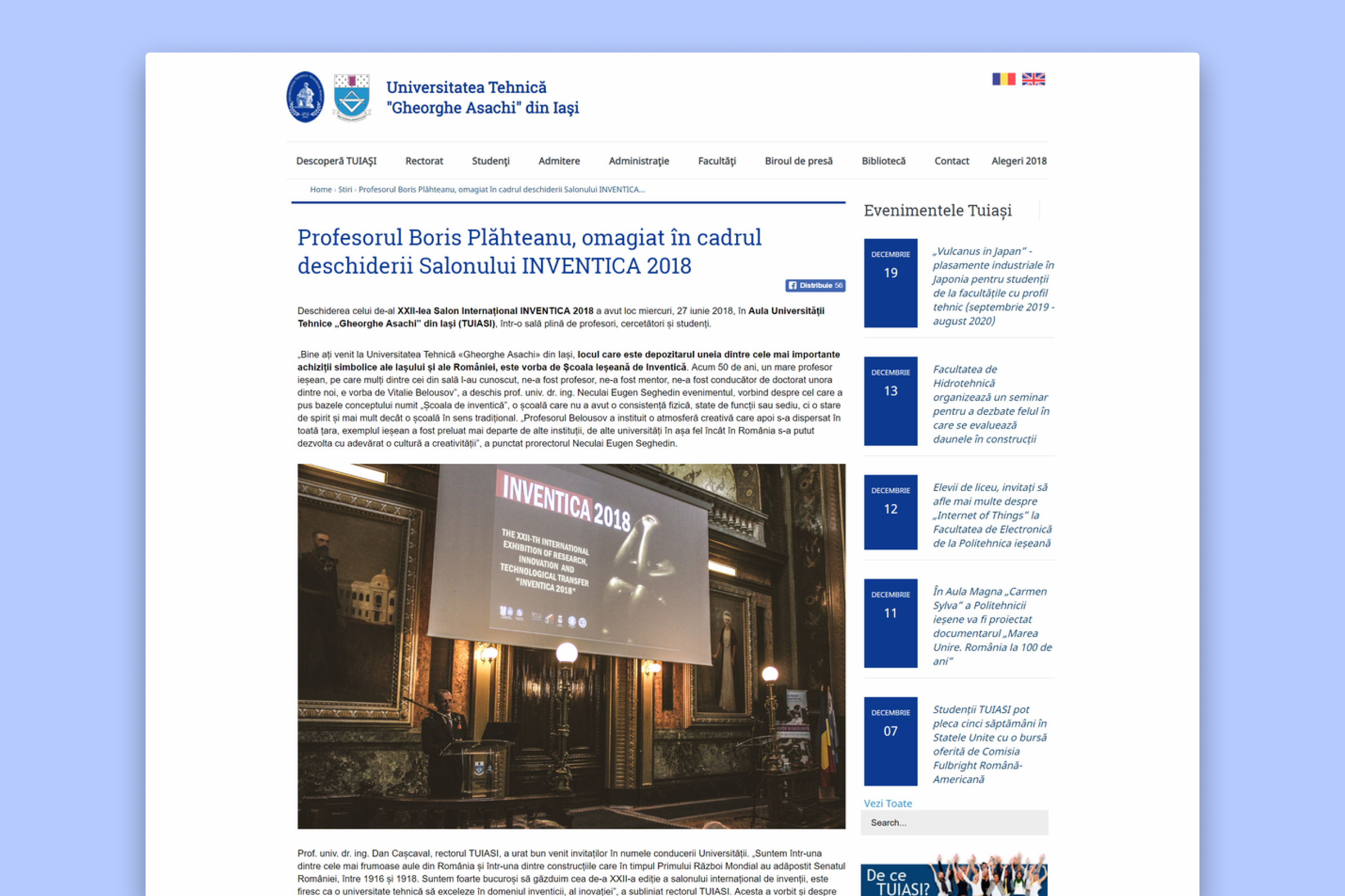
Yet its digital home told a different story: outdated visuals, slow loading, and inconsistent faculty websites that each followed their own logic.
Navigation went five levels deep, triggered by hover menus that broke on mobile. Visual identity varied from one faculty to another. The result was digital fatigue — users spent more time finding information than learning from it.
In short:
Limited brand coherence. Inconsistent navigation. Outdated technology.
The Challenge Behind the Ceremony
At first glance, the scale of redesign seemed unrealistic — a legacy CMS, outdated code, and 14 decision-makers across faculties and governance bodies.
The only viable path forward: divide and conquer.
We split the project into two phases:
Phase 1 — Rapid Redesign before the presidential ceremony.
Phase 2 — Research, Information Architecture & Long-Term Strategy.
Phase 1: The Rapid Redesign
There was no time for workshops or usability tests. Every pixel had to count.
Focus: speed, clarity, and reliability.
Key actions
Rebuilt the CSS grid for better hierarchy and spacing.
Removed background textures and images, replacing them with clean, brand-aligned colors.
Simplified typography to two weights, improving readability and rhythm.
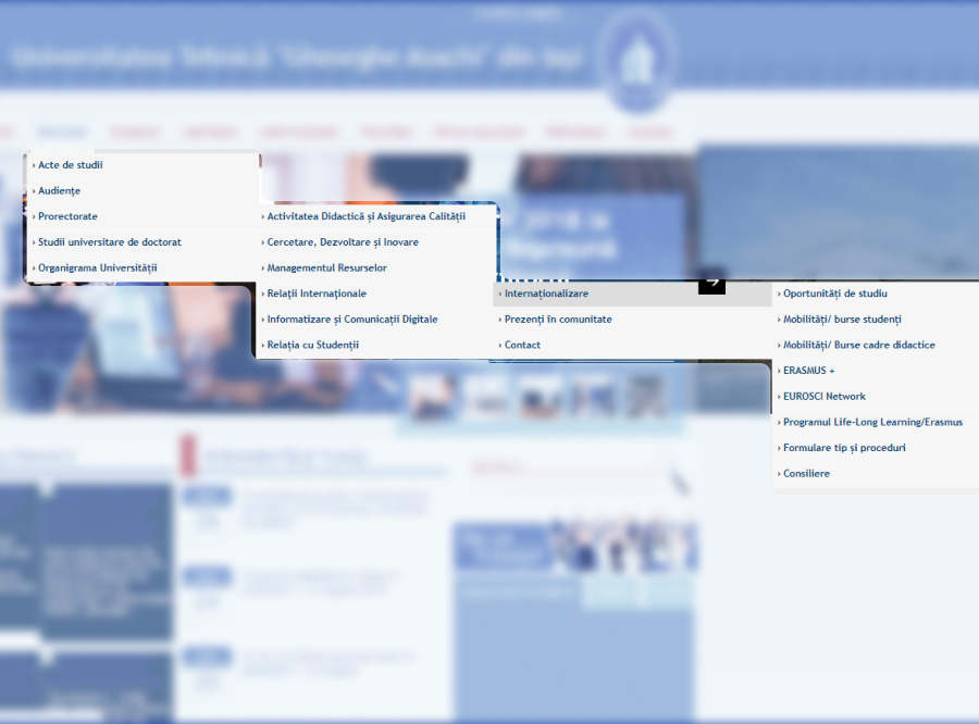
Reworked navigation — no more five-level hover chains.
Compressed and optimized media assets.
(Homepage reduced from 14 MB to 1.3 MB — a 91% decrease in page weight.)
Despite being limited to front-end updates, the transformation was dramatic. The website became faster, cleaner, and accessible — ready for national visibility.
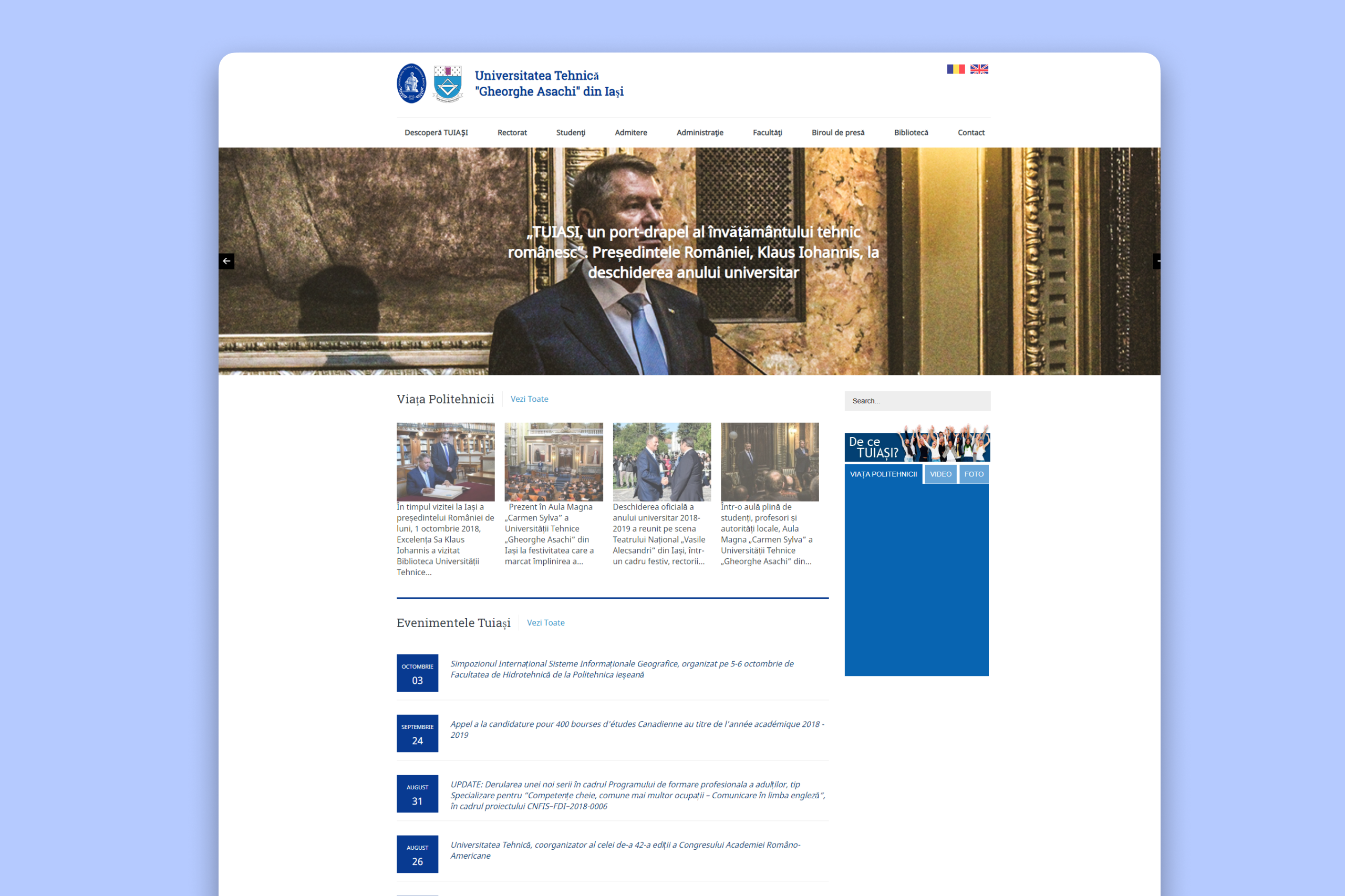
Just weeks later, the new version went live.
During the presidential ceremony, it performed flawlessly — zero downtime, zero errors.
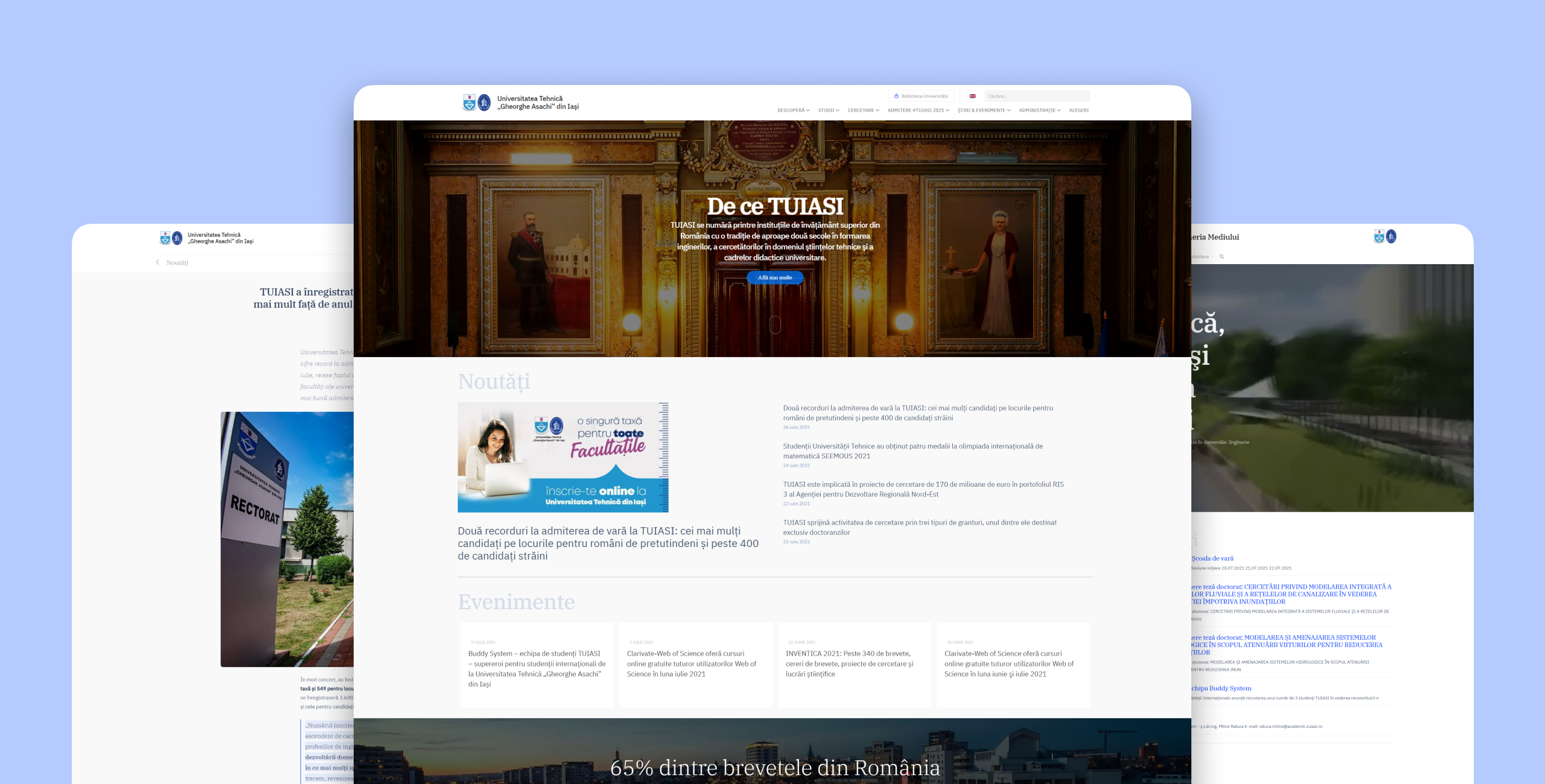
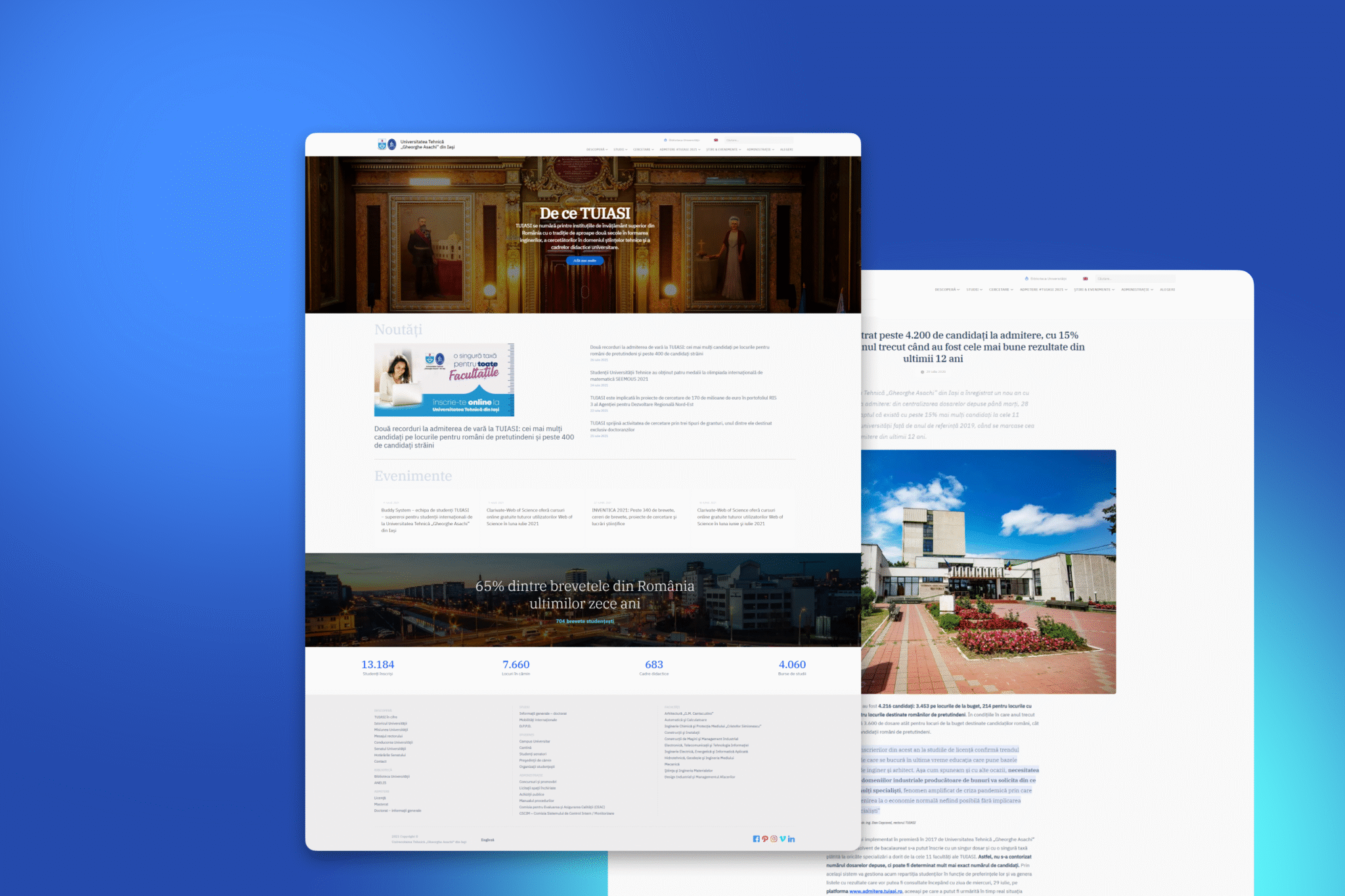
Home Page (Before& After)
from cluttered and heavy to bright, fast, and legible.
Article Page (Before & After)
restructured for clarity, hierarchy, and responsive performance.
Phase 1: Results
The outcome exceeded expectations.
Perhaps most importantly — it performed flawlessly during the ceremony, handling the surge of traffic without crashes or visual errors. That success built the trust needed to proceed to the next phase — a full redesign of the university’s digital ecosystem.
loading time than before (based on our performance tests)
and readable layouts across all devices
branding aligned with the university’s identity
Phase 2: Research, Information Architecture & Strategy
Once the urgency passed, it was time to fix the foundation.
We conducted a UX audit and competitor analysis across Europe’s top universities to identify successful higher-education patterns.
What we found
Leading institutions structure navigation by interest: About, Academics, Admissions, Research, Campus Life.
Secondary menus serve audiences: Students, Faculty, Alumni, Parents, International.
TUIASI’s site, by contrast, mixed everything. Administrative content sat beside marketing pages; student resources were buried in faculty sub-sites; even translations were inconsistent.
So we rebuilt the architecture from scratch.
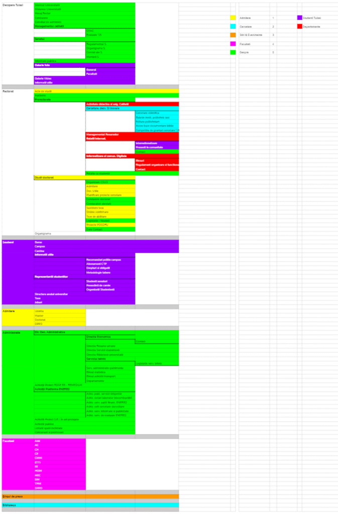
Information Architecture Reimagined
Primary Navigation (based on interests)
Discover (about, leadership, mission, history)
Schools & Faculties
Admission
Research
News & Events
Secondary Navigation (based on user types)
Students
University Staff
Alumni
International Students
Parents
Enhancements included:
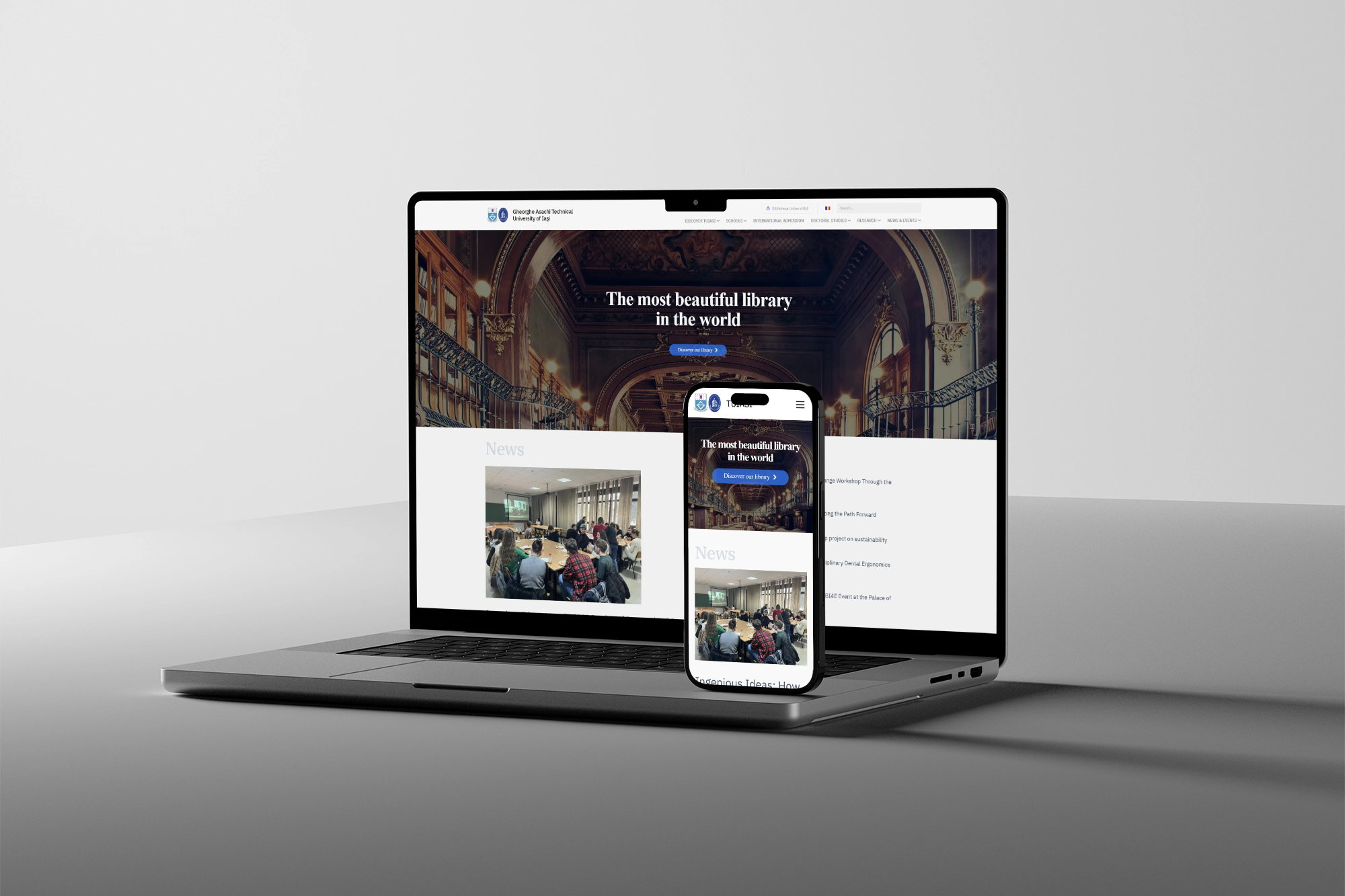
A bilingual language bar (RO / EN).
A click-based mega-menu for mobile usability.
Dedicated landing pages for each audience with tailored CTAs.
“Behind every visual decision lay an organizational challenge.”
Behind every visual decision lay an organizational challenge.

Behind every visual decision lay an organizational challenge.
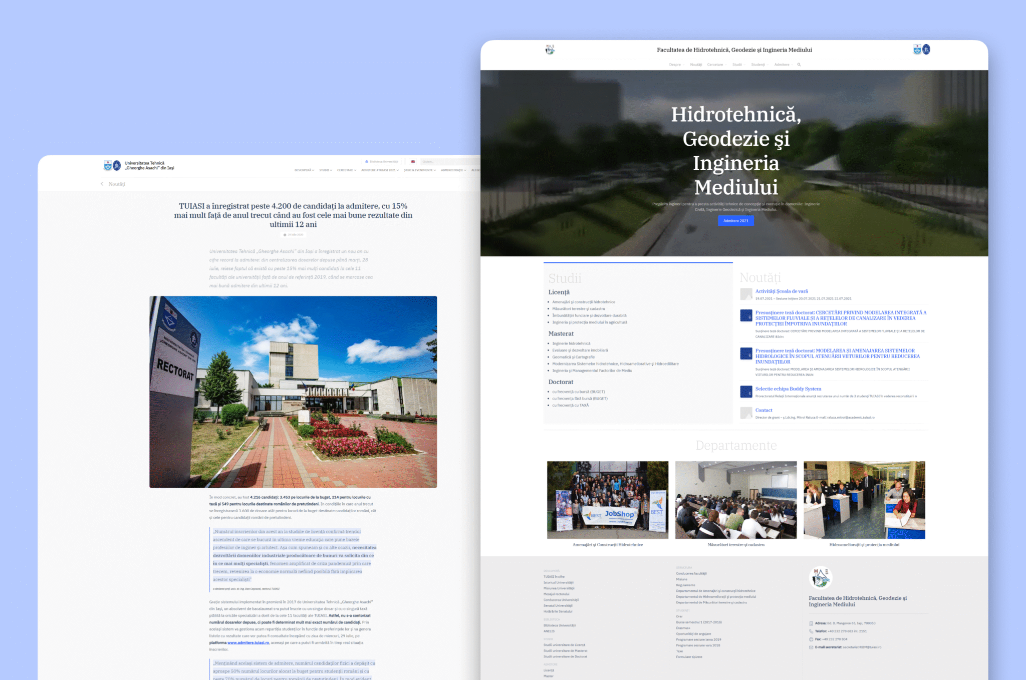
Visual Consistency Across 11+ Faculties
The hardest UX problem wasn’t the homepage — it was unifying 11 independent ecosystems. Each faculty had its own look, structure, and tone.
We built a unified design language to bring coherence without stifling individuality:
Shared color palette and typographic scale.
Common header and footer linking every faculty site back to tuiasi.ro.
Consistent iconography and accessibility rules.
For the first time, TUIASI looked and felt like one institution online.
Governance: The Hidden Layer of UX
Universities are decentralized organisms. Each faculty had its own editors, servers, and approval chains.
To ensure real adoption and sustainability, we:
Collaborated with each dean to gather feedback and priorities.
Created migration guidelines to preserve URLs and SEO.
Developed shared CMS templates to make updates safe and simple.
This was more than design — it was digital diplomacy.
Results: From Redesign to Real-World Impact
“It wasn’t just a website launch. It was a moment of unity for the entire institution.”
When the new TUIASI website launched before the 2019 admissions season, the results were immediate:
- +4,200 new students — the highest admissions growth in 12 years.
- The university achieved record visibility in media coverage.
- 10× faster loading across pages.
- Consistent branding across all faculties.
- Bounce rate decreased, and session time increased significantly.
The redesign became a national reference for modernization in higher education.
From Crisis to Clarity
What began as a four-week emergency became a model for strategic modernization.
Today, TUIASI’s website stands as proof that even complex public institutions can move fast, align stakeholders, and use design to drive measurable results.
From national universities to private academies, we help educational institutions evolve their digital identity with speed and precision.
