Turning Complexity into Clarity in a Data-Driven World

Overview
Anylyze is a data analytics platform designed for power users — people who spend hours each day slicing, filtering, and interpreting millions of records. Its mission is simple yet ambitious: help organizations extract meaning from massive datasets through intuitive visual tools.
However, when we first looked at the product, we noticed a clear disconnect between data capability and usability. Despite the strength of its analytical engine, the interface made even basic interactions feel heavy. There were too many visual elements competing for attention, overlapping components that made actions hard to perform, and a general sense of visual fatigue.
That’s where we came in.
Our challenge at Product Rocket was to help Anylyze create a more intuitive, visually balanced, and accessible environment — one where users could focus on insight rather than interface. This wasn’t about adding features, but about removing friction, restoring hierarchy, and making complex workflows feel natural.
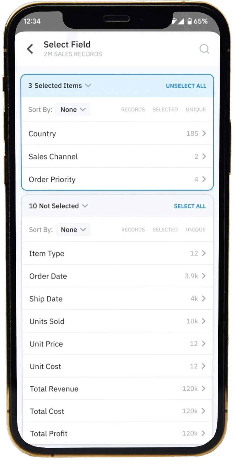
The Challenge
Data platforms live and die by clarity. When users spend their time navigating the interface instead of exploring the data, productivity and trust plummet.
In the version we inherited, several key issues stood out during our audit and initial user testing:
- High information density: Users were presented with too much content at once. The visual weight of every element felt equal, leaving no guidance on what to look at first.
- Accessibility issues: Several text elements failed to meet WCAG contrast ratios. Grey text on light backgrounds made the interface harder to use, especially for those with visual impairments.
- Overlapping interactions: Buttons were partially covering selection lists, making it nearly impossible to click certain items — a clear violation of usability fundamentals.
- Unclear states: The “Selected items” area remained visible even when empty, confusing users into thinking they had missed a step.
- Lack of affordance: Certain interactive elements (like field values) looked disabled because of their grey background, even though they were actionable.
This combination of visual clutter and poor feedback mechanisms led to hesitation, misclicks, and longer completion times. Users had to think too much about how to interact with the tool — when they should’ve been thinking about the data itself.
Our goal was to decrease cognitive load and improve interaction efficiency — while maintaining the analytical depth that Anylyze users relied on.

Heuristic Evaluation
We began with a deep dive into the existing workflow, mapping each interaction and identifying where users encountered friction. Using Nielsen’s usability heuristics as a framework, we flagged issues under categories like visibility of system status, error prevention, consistency and standards, and recognition over recall.
Next, we conducted rapid usability tests with both new and experienced Anylyze users.
We asked them to perform simple tasks like:
Selecting and deselecting fields
Sorting results
Adding items to a “selected” list
Searching for a field among thousands of options
Watching how users interacted revealed subtle but critical behaviors: hesitation before clicking, back-and-forth scrolling, and second-guessing selections. These weren’t user mistakes — they were design communication failures.
Accessibility Audit
We ran an accessibility analysis against WCAG 2.1 AA standards. Several instances of insufficient color contrast and ambiguous states were documented. We defined a new palette and contrast baseline for all text, icons, and background layers, ensuring legibility even in low-contrast screens or under sunlight.
Wireframing and Prototyping
We explored multiple layout variations, focusing on how users scanned the screen and how visual grouping could reduce effort. Early iterations played with bold section dividers and color accents, but user feedback steered us toward a minimalist hierarchy — one that relies on whitespace, subtle separators, and micro-interactions instead of heavy visuals.
Validation and Iteration
Prototypes were validated with the same group of users in short, focused testing sessions. Each iteration aimed to reduce clicks, clarify next steps, and make the interface feel predictable — a key principle in complex environments.
The Design Solution
The first major improvement was structural. We reorganized the interface around clear content blocks, giving each section room to breathe. Items that previously felt crammed together were now grouped with consistent spacing and visual anchors.
The search bar was moved to the top bar, freeing up vertical space and aligning with common user expectations. Sorting controls were placed directly next to the data list they influenced — creating a visual link between action and outcome.
Strengthening Visual Hierarchy
We introduced a multi-tiered text system with consistent font weights and sizes to create natural scanning patterns. Headers guide the eye, secondary labels assist without distraction, and tertiary information is visually quiet but accessible.
Every interactive element was visually reinforced through consistent states: Default, Hover, Active, Disabled.
This predictable visual rhythm builds user confidence — once a user understands one part of the interface, they intuitively understand the rest.
Fixing Accessibility and Contrast
We redesigned the color system with accessibility in mind. All text, icons, and primary buttons were re-evaluated against WCAG 2.1 AA contrast ratios.
Interactive areas now meet or exceed the recommended 4.5:1 contrast, making the interface usable for a broader range of users — including those with mild vision impairments or on lower-quality screens.
Smarter Empty States
The “Selected items” section was redesigned to appear only when needed. When no selection exists, the section is hidden, keeping the layout clean.
Once a user adds an item, the section slides into view, providing instant feedback. This micro-interaction subtly communicates cause and effect, reinforcing understanding through motion.
Context-Aware Actions
Previously, users could click “Add to selected” even if nothing was selected, resulting in frustration. The new behavior disables the button until a valid selection is made. It’s a simple change — but one that eliminates confusion and wasted clicks.
This approach embodies our design philosophy: every interaction should guide, not punish.
Consistency and Alignment
In the updated layout, every action is located near the element it affects. Sorting, selection, and clearing actions all live close to the data table — not scattered across the screen.
By aligning function with context, we made actions faster to find and easier to memorize.
Polished Interaction Details
We also introduced subtle hover states, gentle shadows, and button background contrast to create a tactile feel.
These details may seem small, but they play a major role in perceived quality. The result is an interface that feels cohesive, intentional, and satisfying to use.
Complexity doesn’t have to feel complicated — and this project proved it.

Complexity doesn’t have to feel complicated — and this project proved it.
Impact & Results
To validate the redesign, we ran comparative usability tests on the old and new versions of the interface.
Users consistently described the new version as “lighter,” “cleaner,” and “more predictable.”
The redesigned interface now reflects the clarity and precision that define Anylyze as a data company. It empowers users to work efficiently while maintaining a sense of visual calm — something rare in analytics products.
+38% faster
Task completion time reduced from ~2m15s to less than 1m23s (avg.)
–71% fewer errors
Error rate reduced from 17% to less than 5%.
+54% improvement
User confidence (self-reported) from 6.1 to 9.4 (out of 10)
100% compliant
Accessibility compliance from Partial (WCAG fail) to Full (WCAG 2.1 AA)


Lessons Learned & Reflection
At Product Rocket, we believe design is not decoration; it’s communication. In a product like Anylyze, where users handle millions of data points, even small visual or behavioral details can have exponential effects on efficiency.
Every redesign teaches us something deeper about human-system interaction. For Anylyze, the takeaway was that perceived simplicity doesn’t come from reducing features — it comes from reducing uncertainty.
A few key insights from this project:
- Hierarchy is the foundation of comprehension. Without it, users can’t tell what matters.
- Accessibility drives universality. Designing for everyone inherently improves clarity for everyone.
- Dynamic visibility creates focus. Interfaces should only show what’s relevant in the moment.
- Preventing errors is more valuable than fixing them. A disabled button communicates better than an error message ever could.
- Consistency breeds trust. Once users understand one component, they should understand them all.
These principles guided not just the final outcome, but also the collaborative process between Product Rocket and the Anylyze team. Together, we built more than a cleaner interface — we built a smarter user experience architecture.