Branding
A bold American-style burger brand that grew from local restaurant into a cultural icon.
When Big5 came to us, the burger scene in Iași was completely saturated. Every corner had a burger joint, and they all looked the same — industrial fonts, dark walls, exposed brick, menus trying too hard to be edgy. It was a sea of sameness. Customers had zero emotional reason to pick one over another.
Big5 didn’t just need a logo. They needed a reason to exist in people’s heads — a brand story sharp enough to cut through the noise and build real loyalty in a market where the next burger place was always just around the corner.
The founders had passion and killer recipes. What they didn’t have was a visual language, a strategic position, or any brand architecture to build on.
We didn’t start with design. We started in the kitchen. The founders had five original recipes they considered untouchable — perfected over years of experimentation and family gatherings. Those five recipes became the strategic anchor for the entire brand.
Each recipe had its own flavor philosophy, and together they told a story about what Big5 stood for: big flavor, big character, small ego. The food was ambitious and unapologetic, but the attitude was warm and unpretentious.
After dozens of explorations, we landed on something that captured the brand’s dual nature — American inspiration filtered through Romanian warmth:
“Savor the American Dream”
This wasn’t about copying American culture. It was about capturing the optimism, generosity, and boldness of the best American food — then grounding it in local ingredients, local hospitality, and local pride.
The Big5 logo pulls from mid-century American diner aesthetics — a retro wordmark with confident weight and playful curves. It feels nostalgic without being dated. Bold without being aggressive. It works just as well on a neon sign as it does on a paper bag or an Instagram story.
We built a primary logo, a compact mark for small applications, and a badge variant for merch and packaging. Every version carries the same personality: approachable confidence.


We built the palette around two emotional poles:
Supporting colors came from condiment inspiration: mustard yellows, pickle greens, and toasted bun golds. They feel natural in a food context while giving marketing materials plenty of range.


We created a full set of custom icons to bring the brand to life across touchpoints. Each one was hand-drawn before being digitized, keeping that human warmth that separates Big5 from corporate burger chains. The icons cover menu categories, dietary info, ordering flow, and social media.
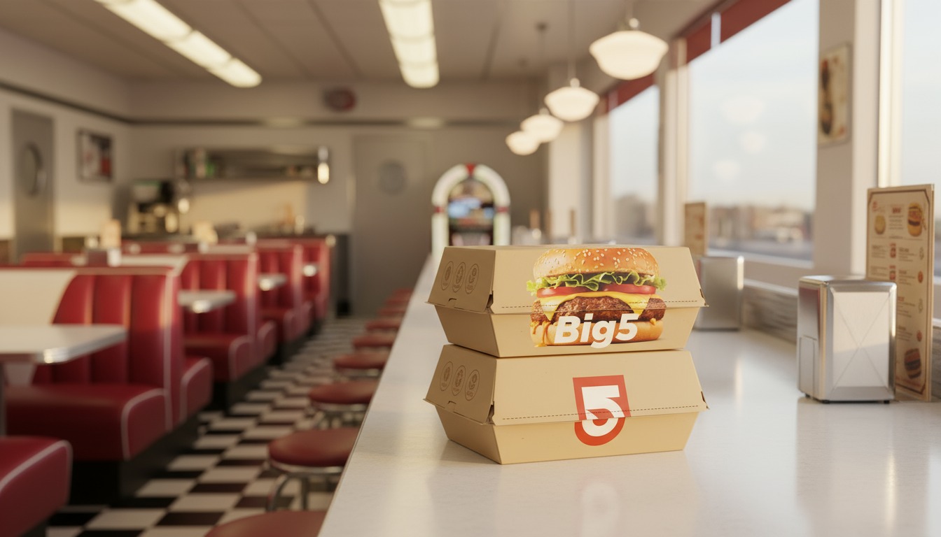
Every piece of packaging — burger wraps, napkins, takeaway bags — was designed as a brand moment. The wrapping paper has a repeating pattern of custom illustrations. Bags carry the tagline. Even the receipt has personality.


We restructured the menu around the five founding recipes as hero items, with supporting items organized by flavor profile instead of traditional categories. Big photography, clear pricing, and honest descriptions replaced the cluttered layouts they’d been using before.
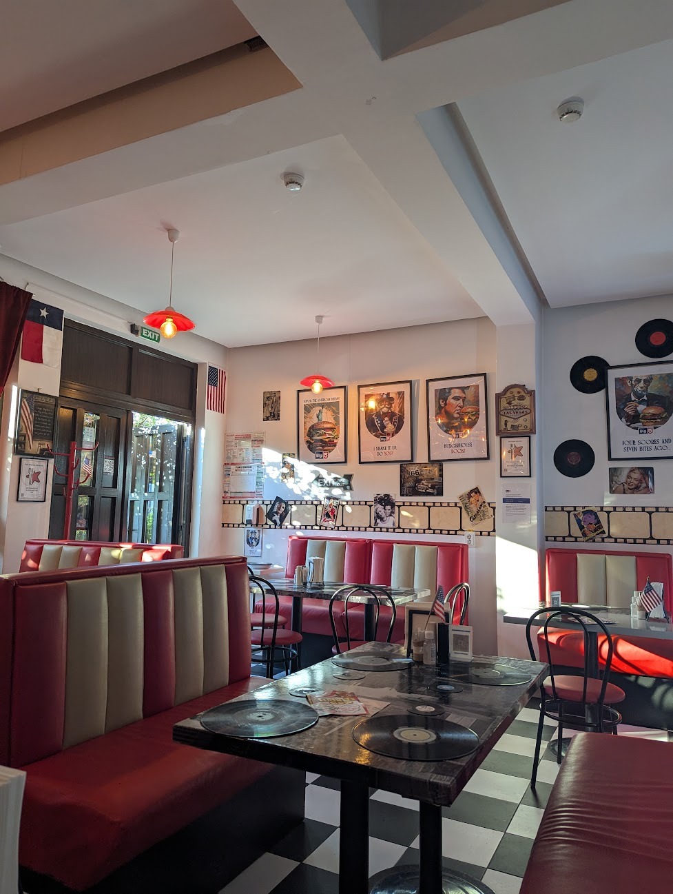
We provided art direction for the restaurant interior — paint colors, signage placements, material recommendations, and lighting guidelines. The goal was to make walking in feel like stepping into the brand: warm, confident, and distinctly Big5.
The organic social strategy leaned hard into the brand’s personality. No stock photography. No generic food shots. We built a visual language around close-up textures, behind-the-scenes kitchen moments, and customer-first storytelling. It generated 100% organic traction from day one.

Big5 launched to immediate recognition. Within its first year, it became the number one hospitality brand in Iași — not through paid advertising, but through the compounding power of a brand people genuinely wanted to talk about. The five founding recipes became local legends, and the visual identity became instantly recognizable across the city.
The brand proved something we’ve always believed: in a saturated market, the winner isn’t the one who shouts loudest. It’s the one who knows exactly who they are.
Ready?
We'd genuinely love to hear what you're working on. No pitch, just a conversation.
Apply for a Strategy Audit